
How much the cost billboard advertisement in Indonesia?
Wednesday, 20 Mar 2024
PT Lestari Dev Solusindo
Aldeoz Building Lt. 6, Jl. Wr. Jati Barat No.39, RT.2/RW.4, Kalibata, Pancoran, Jakarta Selatan, DKI Jakarta, 12740.
+6281389455717 - contact@lestariads.com
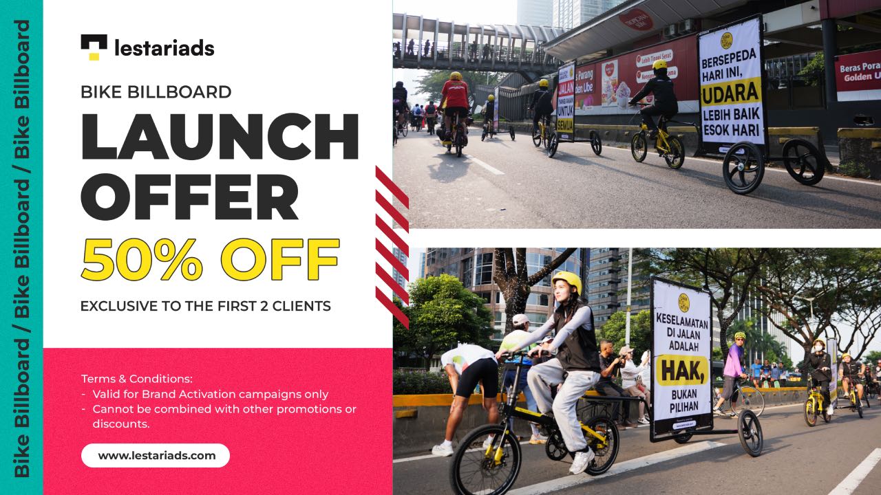
www.lestariads.com

Billboards are a powerful advertising medium due to their massive size and strategic placement. However, being big and visible is not enough. Amid the visual noise of Indonesian city streets, only billboards that resonate with local consumer psychology are able to grab attention — and more importantly, drive action.
So how do you create billboard content that is not only eye-catching but also converts? The answer lies in understanding how Indonesian consumers think and feel.
Indonesian consumers have unique characteristics that affect how they receive advertising messages:
Color plays a big role in grabbing attention and creating certain feelings:
| Color | Psychological Effect | Suitable For |
|---|---|---|
| Red | Energy, urgency, courage | Promotions, discounts, calls-to-action |
| Blue | Trust, calmness | Financial products, tech |
| Green | Nature, health, balance | Eco-friendly goods, healthy food |
| Yellow | Optimism, alertness | Kids’ products, cheerful brands |
| Black/White | Elegance, luxury, minimalism | Fashion, high-end products |
Tip: Use bright colors for key elements (like CTAs, promos) and neutral backgrounds so the message stands out.
A billboard only has 3–5 seconds to deliver a message. So the text must be:
Examples of effective phrases by region:
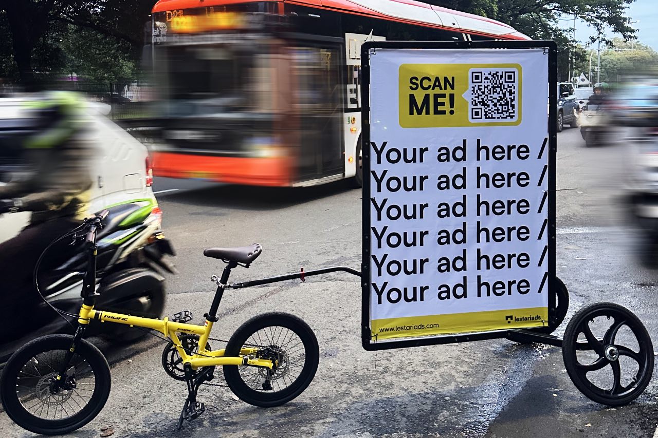
Billboard design must consider viewing distance and road user speed. Practical guidelines:
Pro tip: Test your design on a real billboard mockup before launch. Stand 50–100 meters away — can it still be read clearly?
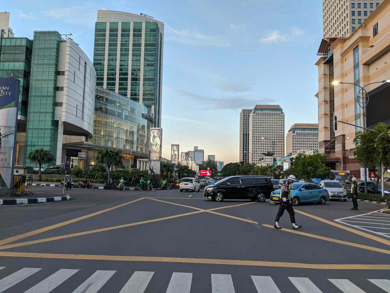
A billboard in a business district (CBD) performs differently than one near schools or religious sites. Location segmentation affects communication style:
| Location | Communication Style |
|---|---|
| Office area | Professional, exclusive, efficient |
| Around schools/universities | Fun, colorful, educational |
| Tourist areas | Inspirational, relaxed, strong visuals |
| Toll roads | Minimalist, direct to CTA |
Example:
In Sudirman, Jakarta → use a headline like “Smart Choices for Future Investments”
In Malioboro, Yogyakarta → try “Taste Culture Through Flavor”
Use data to evaluate your billboard’s performance:
You can also A/B test by changing the headline or visual on two similar billboards and comparing the results.
A converting billboard isn’t just about having an attractive design — it’s about understanding the emotions and habits of local consumers. By combining color psychology, persuasive language, and cultural insight, your OOH ad becomes more than a “big board” — it becomes a true trigger for real action.

by Milanello
Wednesday, 20 Mar 2024
Thursday, 31 Oct 2024

Friday, 9 May 2025
Wednesday, 26 Feb 2025

Lestari Ads Agency - PT Lestari Dev Solusindo
Lestari Ads is a leading out-of-home media company with the largest network in Indonesia. We believe the world is a canvas. Every advertisement is an opportunity to inspire, engage, and transform public spaces. We continuously push boundaries in Out-Of-Home (OOH) advertising, changing the way brands interact with audiences beyond the digital screen, bringing stories to life where people live, move, and connect.
The most trusted OOH advertising agency in Indonesia
Experience the top of visibility with Indonesia's leading out-of-home (OOH) advertising agency. We specialize in turning the urban landscape into a dynamic canvas for your brand, crafting compelling narratives that capture the imagination of millions. Our mastery over strategic placements and innovative formats ensures your message not only reaches, but resonates with a diverse and expansive audience. With a proven track record of delivering high-impact campaigns across Indonesia's bustling cities and beyond, we redefine what's possible in OOH advertising.
Find the best quality billboard advertising space with variety of size and dimension
out-of-home advertising, digital billboards, traditional billboards, transit advertising, street furniture advertising, outdoor signage, digital ooh, led billboards, static billboards, large format advertising, advertising displays, ooh media, advertising billboards, outdoor digital screens, urban advertising, roadside billboards, digital signage, retail advertising, poster advertising, mobile billboard advertising, digital transit ads, interactive ooh, airport advertising, mall advertising, cinema advertising, sports venue advertising, digital outdoor advertising, public transportation ads, taxi advertising, bus shelter ads, pedestrian advertising, advertising kiosks, outdoor media solutions, billboard marketing, ooh advertising strategies, ooh media planning, digital billboard solutions, smart billboard advertising, contextual ooh ads, geotargeted ooh ads, location-based ooh, smart outdoor ads, programmatic ooh, data-driven ooh, brand awareness billboards, large-scale ooh campaigns, outdoor advertising effectiveness, billboard design, high-traffic billboard locations, hyperlocal ooh, street-level ooh, public transit advertising, ooh campaign management, outdoor digital displays, media buyers ooh, roadside digital ads, metro station advertising, shopping center ads, ooh advertising trends, outdoor media buying, bus wrap advertising, illuminated billboards, building wrap advertising, branded outdoor advertising, billboard networks, freeway advertising, expressway billboards, train station advertising, out-of-home advertising campaigns, event-based ooh ads, ooh media buying strategies, proximity-based ooh, national ooh campaigns, city-wide ooh advertising, large-scale outdoor campaigns, integrated ooh solutions, ooh digital networks, smart city advertising, mobile billboard solutions, dynamic outdoor ads, highway billboard advertising, ooh media optimization, digital out-of-home screens, high-impact ooh ads, retail digital signage, interactive billboard advertising, regional ooh advertising, local outdoor advertising, consumer engagement ooh, brand visibility outdoor ads, targeted billboard advertising, digital advertising screens, urban billboard advertising, weather-triggered ooh ads, motion sensor billboards, flexible ooh solutions, sustainable outdoor advertising, renewable energy billboards, solar-powered billboards, ooh for small businesses, outdoor brand activations.
Frequently Ask Questions
About Us